


Editorial Disclosure
It’s no secret that I’ve been a fan of United’s recent passenger experience upgrades.
The airline has been on a roll with refreshed cabins, better Wi-Fi, improved catering, and a generally more premium feel across the entire operation.
But this latest change? It leaves me shaking my head.
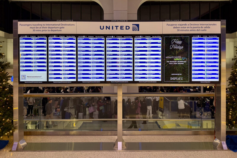
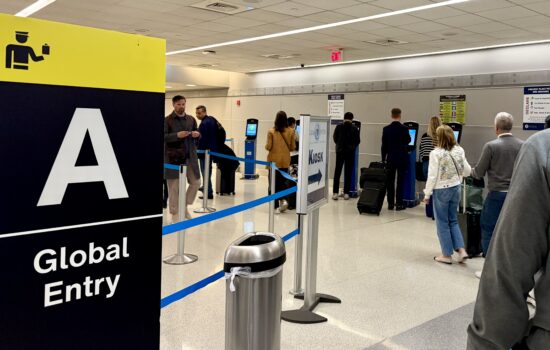
Earlier this week, I flew into Newark and noticed something I’d never seen before upon landing: a completely redesigned layout on the flight status boards (or flight information displays, FIDs, in formal airline speak).
Gone is the classic row-by-row table arranged alphabetically by destination, aka the format used at just about every major airport in the world.
In its place is a new box-style grid that technically shows all the same information, plus gate direction and walking distance, but in a layout that’s both wildly confusing and hard to read.
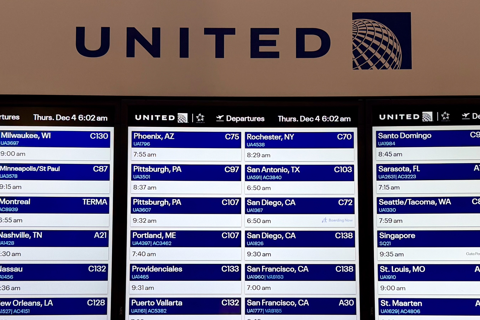
Each flight now gets its own individual box. The destination city, flight number, and gate appear at the top in white text with a blue background.
Directly below that is the departure time and gate direction — this time in black text on a white background.
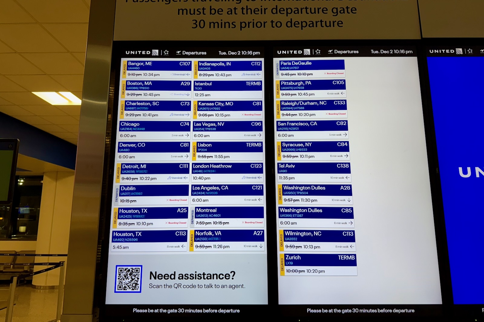
Then there’s the strangest part: a vertical, color-coded status indicator to the left of each box.
Subscribe to the newsletter
Get the front-row look at the evolving world of travel, loyalty, tech and lifestyle — delivered directly to your inbox.
No box means on time, a yellow box means delayed, and a red box means canceled. But the text is rotated sideways, meaning you need to tilt your head to read it.
I’ve been to more airports than I can count, and this is the first time I’ve seen a flight board designed this way. United, for its part, says that this new display is available at all hubs and line stations. For now, line stations don’t receive the wayfinding details.
After studying the new displays for a few minutes, I realized there’s probably a reason airports don’t do this — it’s hard to read, unintuitive to scan, and seemingly frustrating to use.
And it wasn’t just me.
The next morning, I was back at Newark for another trip and watched multiple travelers stare blankly at the monitors, trying to decipher where their flights were. One passenger saw me recording video and said, “Yeah, this isn’t great.”
I nodded, hit publish on my Instagram Reel, and politely asked my United sources to please bring back the classic table format.
In my opinion, this is definitely an “if it ain’t broke, don’t fix it” type situation.
The good news? United tells me that “we’re planning to roll out some additional design changes by the end of the year.”
Subscribe to the newsletter
Get the front-row look at the evolving world of travel, loyalty, tech and lifestyle — delivered directly to your inbox.


What is so hard about this . . . ? The text is bigger and you don’t have to scroll your eyes from one side of the screen to the other matching up rows.
Tilt your head to read it???? That’s the reason for the colors – you don’t need to read anything. If it’s delayed it’s also clearly indicated with the time crossed out and the new time shown. Not rocket science . . .
Travellers not knowing where to find their flight? It’s still in rows alphabetical by destination . . .not sure why the implication that it’s not done that way any more. You simply have larger screens so you can fit two columns on a single screen. This is actually far easier to read than the standard block of identical small text in compressed rows.
I can see how it can be a bit disorienting being different but the sideways text doesn’t personally bother me since it’s a unique color. Yellow and red are good indicators, I don’t need to see if it says delayed or canceled. The blue coloring does seem to mess with the flight numbers at least on the photos you took. And the time to walk info is pretty cool. I use this a lot in the airline apps to judge my timing of any lounges etc. I think most people don’t even know this exists let alone use the apps too much.
The only thing I can’t stand is scrolling flight display data when you’re trying to read details and it scrolls away before you can take it all in. American seems to do this often. I would rather have all the info on a static screen.